
Colour Theory
Colour theory is one of my favourite things in the world to talk about, so I have made a whole page dedicated to educating you on colour theory.
But first, let me expalin how and why I know this.
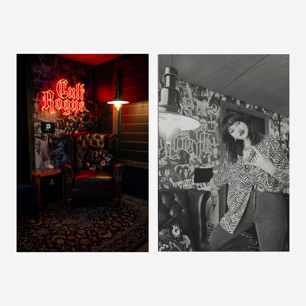
Back when I was in high school, I wanted out, so much so that I did what any girl on the Gold Coast, AUS would do in this situation, I became a hairdresser.
Fast forward to 2020, I open my own salon “Cult Rogue”, built around my love for doing alternative hair and mullets.
Now you don’t give a crap about my working history, I know, but for me personally this then birthed my deep love and fascination with colour theory. I was always experimenting with new ways to make colours and I also have a view secrets up my sleeve that I learnt from experimental behaviour in moments of desperation.
MY CREDENTIALS
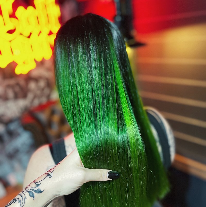
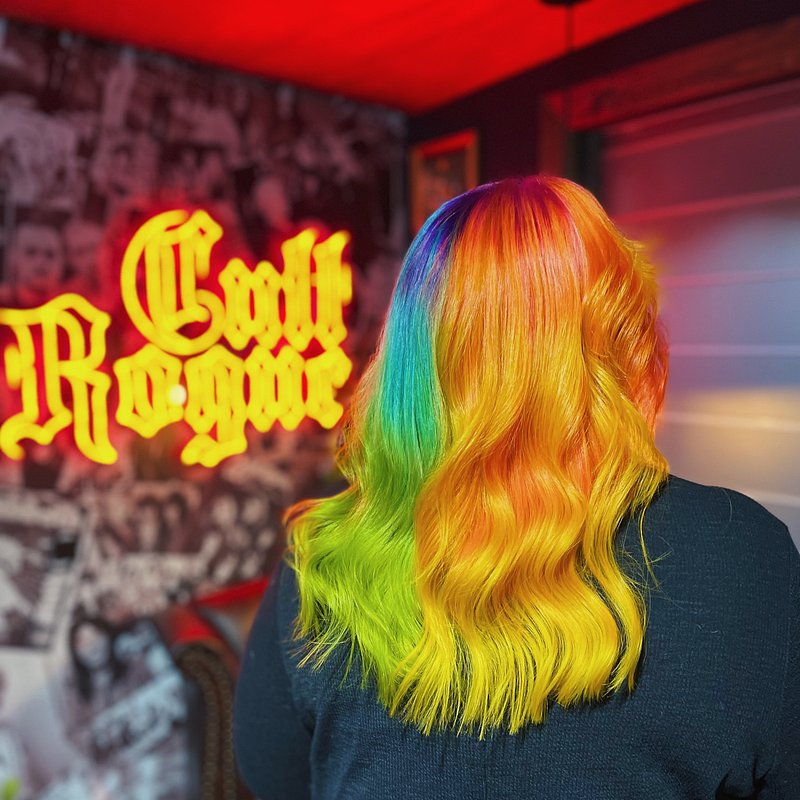
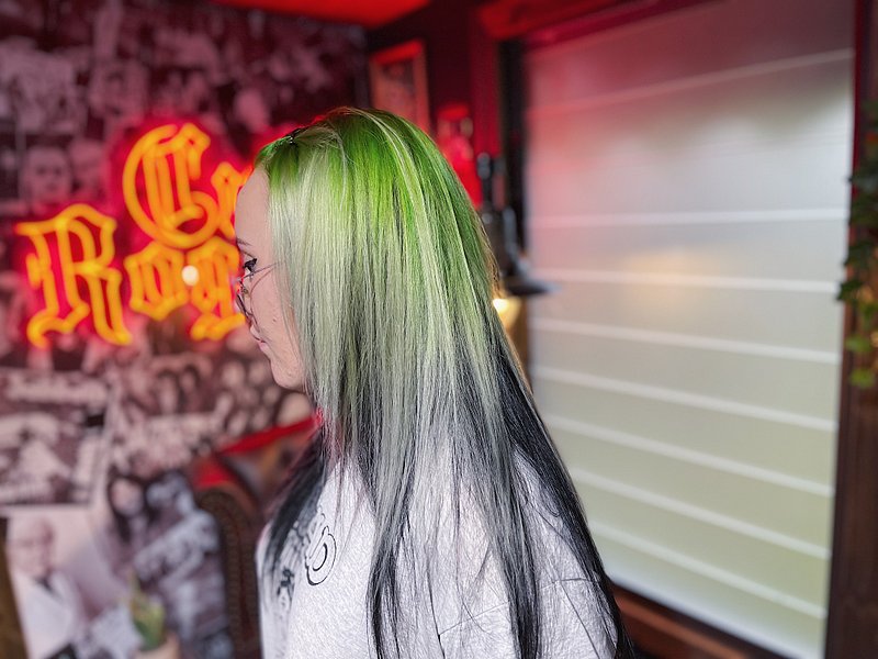


BACK TO BASICS
Before we jump into anything we need to understand the basics, and once you have the basics down, the rest is easy!
Primary Colours
Blue, Red and Yellow
Complimentary Colours
Complimentary colours are the colours used to neutralise the a colour. Purple neutralises yellow, blue neutralises orange and green neutralises red.
So let’s say you’ve made a green and you need the green to be less vibrant and more muted, you would add the tiniest bit of red to the mix, slowly.

USING THE COLOUR WHEEL TO CREATE COLOURS
When explaining this to people for the first time I like to use the term 'Bridging Colours' as I have found that this is the terminology that helps people to remember.
How to organically spot it
Look at the colour you are wanting to achieve and then look at the two shaded on either side and this will tell what colours are needed to make that colour. When giving this example I like to use the primary colour bridging to each other as fundamentally you cannot make a true primary colour again but you can make any colour from the primary colours.
While you cannot make a true primary colour with the complimentary shades it is possible to still make a version of the target primary colour.
How to make a different type of target colour
So this wheel is a broken down to simplify thing because if it was to show you every single colour we would be currently looking at a wheel with 16,777,216 colours on it. Crazy right!
This wheel also makes life a little easier for me when explaining this part. If your target shade is one of the swatches between the labeled swatches eg. Teal, what you need to do is look at what primary colour is closest to it, which in this case would be blue, and then look at the other primary colour which is yellow. This tells me that we need 2:1 ratio when mixing the colour, so 2 parts blue to 1 part yellow.
HOW TO USE THIS IN PRACTICE / REAL WORLD TIPS
- Colour theory is super important in underpainting & canvas prepping, if you are painting an outdoor scene, and the sun is out, everything naturally would have that hint of yellow in it, so I always recommend painting the canvas yellow before doing your lines, so this way nothing feels flat or dull, it just makes everything more life like.
-
You have laid down a green and it’s that little bit too “blue toned”, look at the colour wheel and find the hue of green you are wanting at look at the primary colour next to it.
You can then,
A. Mix the primary colour into your paint if the paint on the canvas is still wet, or
B. Dilute the primary shade to create a sheer paint, and go over the area you wish to change.